Thursday, November 13, 2008

Star Plots


Star plots allow the cartographer to compare multiple variables. This star plot shows automobile data for different types of automobiles. Each "leg" of each plot represents a different set of data such as price, head room, weight and length.

URL: http://www.math.yorku.ca/SCS/icons/sugi16/staraut2.gif

Correlation Matrix


A correlation matrix depicts a connection between a number of different variables. This correlation matrix is looking at different markets, investing styles, investors and regions.

URL: http://www.investors-routemap.co.uk/images/correlation.gif

Similarity Matrix


A similarity matrix shows how specific data are alike. This similarity matrix looks at the music of the Beatles' Hey Jude. The dark blue represents the chorus or areas of the song that are repeated.

URL: http://www-scf.usc.edu/~ise575/a/projects/shiu/website/index_files/image008.jpg

Steam and Leaf Plot


Stem and Leaf plots show how a variable is distributed in a population. This particular stem and leaf plot shows student grades.

URL: http://www.uow.edu.au/student/attributes/statlit/modules/images/2_50.gif

Box Plot


Box plots generally compare two or more sets of data and are a simple way of depicting data graphically. This box plot shows energy output on four different machines.

URL: http://www.itl.nist.gov/div898/handbook/eda/gif/boxplot0.gif

Histogram


Histograms display tabulated frequencies with the independent variable on the vertical axis and the dependent variable on the horizontal axis. This particular histogram displays the number of students and their score on the final exam.

URL: http://media.techtarget.com/digitalguide/images/Misc/iw_histogram.gif

Parallel Coordinate Graph


A parallel coordinate graph can be somewhat confusing as it uses additional vertical axis and plots points along all sides of the graph both vertically and horizontally as well as left to right.

URL: http://informationandvisualization.de/files/parallel_lines_m.jpg

Triangular Plot


Triangular plot graphs depict three variables on an equilateral triangle. This particular triangular plot graph is looking at the likely majority winner in England's parliament in 2005.

URL: http://ex-parrot.com/~chris/images/20050407/triangle.png

Wind Rose


A wind rose shows wind frequencies and directions during a selected period of time. This wind rose shows wind frequency, mostly from the west, out of the San Francisco area in 1998.

URL: http://mensch.org/vplot/windrose2/windrose.png

Climograph


A climograph shows a relationship between temperature and precipitation and is generally plotted in monthly intervals. This particular climograph is for Walgett, Australia and you can see that during the summer months they receive more rain.

URL: http://www.uwsp.edu/geo/faculty/lemke/geog101/images/09_climograph_BSh.gif

Population Profile


Population profiles display age and sex distribution for a given region. This particular population profile is comparing the age and sex of people in Coventry, England compared to the national average for England.

URL: http://www.coventry.gov.uk/ccm/cms-service/stream/image/?image_id=1660022

Scatterplot


A scatterplot depicts a relationship between two variables and can show additional data by using color and textures. This scatterplot shows the relationship between heart rate and age.

URL: http://www.ailab.si/janez/scatterplot.png

Index Value Plot


This is an example of an Index Value Plot. It depicts the departures from the norm of streamflow at a particular station in North Carolina.

URL: http://water.usgs.gov/waterwatch/regplots/real/real_nc_2.gif

Accumulative Line Graph or Lorenz Curve


A Lorenz Curve is used in statistics to portray items such as wealth and income. This particular Lorenz Curve portrays the percentage of income against the percentage of households' actual income.

URL: http://content.answers.com/main/content/wp/en/b/bd/Lorenz-curve1.png

Bilateral Graph


A bilateral graph depicts the differences in a relationship between two variables. This bilateral graph shows the growth rate of humanitarian assistance across the globe between 2005 and 2006.

URL: http://www.globalhumanitarianassistance.org/New%20Images/Growth%20in%20bilateral%20humanitarian%20assistance%202005-2006%20copy.jpg

Nominal Area Choropleth Map


A Nominal Area Choropleth Map portrays qualitative data, classified into groups. This particular map portrays minority groups with the highest percentage of population per state.

URL: https://courseware.e-education.psu.edu/courses/geog482/graphics/citationexample.jpg

Unstandardized Choropleth Map


This unstandardized choropleth map depicts the total water useage per day in the United States. Unstandardized choropleth maps are not areally averaged and focus on data totals.

URL: http://pubs.usgs.gov/fs/2005/3051/images/2000choropleth.gif

Standardized Choropleth Map


This standardized choropleth map is areally averaged to show the percentage of the Canadian population under 14 years of age. Each grouping of percentages is represented by a different shade of color.

URL: http://www.statcan.ca/english/research/92F0138MIE/2008003/figures/figure3.1-en.jpg

Univariate Choropleth Maps


A univariate choropleth map shows one set of data as opposed to a bivariate choropleth map which shows a realtionship between two sets of data. This particular map depicts poverty levels within the United States.

URL: http://www.cdc.gov/pcd/issues/2007/oct/images/07_0091_02.gif

Bivariate Choropleth Map


This is an example of a bivariate choropleth map. A bivariate choropleth map shows the relationship between two different variables. In this case, life expectancy as related to gross national product in Africa.

URL: http://www.geocities.com/stevejford/Africa_Choropleth.jpg

Unclassed Choropleth Maps


This is an example of an unclassed choropleth map. It shows the flash density of lightning over the United States. This map is considered an unclassed choropleth map because the number of flashes are not areally averaged.

URL: http://www.weather.gov/os/lightning/images/Vaisala_96-05_Flash_Map.gif

Classed Choropleth Maps


This is an example of a classed choropleth map. This map shows the percentage of people by county who are of hispanic or latino origin in Florida. A classed choropleth map is special because it uses shading to depict the different classes of data.
URL: bp2.blogger.com/.../classed+choropleth+map.gif

Range Graded Proportional Circle Map


This range graded proportional circle map showing the population of Michigan. Each circle on the map represents a certain number or range of population of people. This is different from a variable map in that the circle sizes are constant and not variable.

URL: http://mapmaker.rutgers.edu/355/dotProporCircle.jpg


Saturday, October 18, 2008

Continuously Variable Proportional Circle Map


This is a continuously variable proportional circle map. Each circle depicts data. The size of the circle is dependent on the range of data given.

URL: http://www.nature.com/nature/journal/v451/n7181/images/nature06536-f2.2.jpg

DOQQ


DOQQ or digital orthophoto quarter quadrangles maps are aerial photographs used by the USGS to map small sections of a quadrangle.
URL: http://www.crwr.utexas.edu/gis/gishydro00/Class/trmproj/Donnelly/termproject_files/1_Red_DOQQ.jpe

DEM


This is an example of a DEM or Digital Elevation Map. Digital elevation maps give a 3D view of the landscape.
URL: http://www.digiwis.com/mr3img/mr3d5.jpg

DLG Maps


DLG or digital line graphics are data that can be layered on a map giving locations of states, counties, parks, rivers and lakes. This particular elevation map of the United States is overlain with DLG from the USGS.

URL: http://weather.unisys.com/usgs/3sec/usgs-US.gif

DRG Maps


DRG or Digital Raster Graphics are used to collect, review and revise digital data. This DRG map of a portion of Texas is being used as a layer on GIS software.

URL: http://www.tceq.state.tx.us/assets/public/gis/images/drg.gif

Isopleth


This is an isopleth map depicting the amount of acid (pH) in rainfall across the United States.
URL: http://dwb.unl.edu/Teacher/NSF/C14/C14Links/nadp.sws.uiuc.edu/isopleths/maps1998/phfield.gif

Isopach


This is an example of an Isopach map. Isopach maps depict rock or sediment thickness. This particular map is of the Gulf of Mexico and the distribution of Anhydrite beds on the Gulf floor.
URL: http://www.gomr.mms.gov/images_opt/techpap/gp-9509/andy_a.gif

Isohyets


This is an example of an Isohyet map. Isohyet maps measure rainfall. This particular map shows rainfall amounts over Hong Kong.
URL: http://images.google.com/imgres?imgurl=https://blogger.googleusercontent.com/img/b/R29vZ2xl/AVvXsEjl5wZGXIVITl1Yac9-LnvcKB-8jS_M9BRlSJlF6X2tcyKzYqMQyzvuXPmk0MuYNER6J1qKlClWxfF9ZrfcOQnvp5iD2pdp3AILsGnF7P7Glsf4eaDO9e1Szntdr4WSyWPv4TAJYynC8ck/s400/08_06+hong+kong+rainfall+annotated.png&imgrefurl=http://daveslandslideblog.blogspot.com/2008/06/debris-flow-video-from-hong-kong.html&h=400&w=396&sz=183&hl=en&start=7&usg=__qQks77Rcuk3cutEWPMIKia2YBPE=&tbnid=hxC50k9TtWzF_M:&tbnh=124&tbnw=123&prev=/images%3Fq%3Disohyets%2Bmap%26gbv%3D2%26hl%3Den%26sa%3DG

Isotachs


This is an example of an isotach map of the United States. Isotachs measure wind speed and direction.
URL: http://www.rap.ucar.edu/weather/model/eta00hr_300_wnd.gif

Isobars


This is a map displaying isobars. Isobar maps are a type of contour map that shows air pressure.
URL: http://www.met.ie/weathermaps/atl-iso-tom.gif

Remote Sensing Homework


This is an example of Radar. More specifically, Doppler Radar. In this image we are viewing cloud cover over the South Pacific.

URL:
agora.ex.nii.ac.jp/.../kml/globe/latest/1.jpg

Friday, October 3, 2008

LIDAR


LIDAR stands for light detection and ranging. This LIDAR image is of Manhattan. It was used to determine the height of the debris from the World Trade Center collapse on 9/11/01. This image also assisted ground crews in determining what size cranes were needed for recovery and cleanup.
URL:
http://www.noaanews.noaa.gov/stories/images/manhattan-lidar092701.jpg

Doppler Radar


Storm tracking is one of the many uses of doppler radar. Doppler radar in weather uses echoes to determine the velocity of the clouds or storms. This particular doppler radar shows a severe thunderstorm, complete with a tornado hook (depicting a possible tornado) in the Texas panhandle.
URL:
http://images.google.com/imgres?imgurl=http://www.wunderground.com/hurricane/2007/enterprise_anim.gif&imgrefurl=http://www.wunderground.com/blog/JeffMasters/archive.html%3Ftstamp%3D200703&h=480&w=480&sz=557&hl=en&start=32&um=1&usg=__oXV79F6GX9BzeJct9PLhUN_bbUA=&tbnid=3OsnE1vtHWW8cM:&tbnh=129&tbnw=129&prev=/images%3Fq%3DDoppler%2Bradar%26start%3D20%26ndsp%3D20%26um%3D1%26hl%3Den%26sa%3DN

Black and White Aerial Photo


Black and white aerial photos are used because they can show greater detail than color photographs.
URL: http://freegeographytools.com/wp-content/uploads/2007/09/doq-thumb

Infrared Aerial Photo


This is an infrared aerial photo of the Everglades in Florida. This photo was used to study different the environmental impact on several species of trees within the Everglades.
URL:
http://sofia.usgs.gov/publications/fs/2004-3016/images/fig3x.jpg

Cartographic Animation


A cartographic animation is a map that shows some type of motion usually to depict a change. This particular cartographic animation is very familiar to those of us on the Gulf Coast. This is a satellite image of Hurricane Katrina from September, 2005.
URL:http://www.spc.noaa.gov/misc/carbin/katrina/kat5_1945.gif

Statistical Map


Statistical maps represent statistics whether it is a percentage, ratio, rate or other statistical data. This particular statistical map shows the growth rate of internet use in Africa in the mid 1990's.
URL:
http://personalpages.manchester.ac.uk/staff/m.dodge/cybergeography/atlas/mids_af_i_gr_c_large.gif

Cartogram


A cartogram uses the value of a variable to depict size, rather than using the actual geographic shape and area. This cartogram shows the number of plant species by country.
URL:
http://freegeographytools.com/wp-content/uploads/2007/09/271c-thumb.png

Flow Map


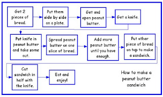
This is an example of a basic flow map which allows you to follow the steps in order to make a peanut butter sandwich. These types of flow maps or process maps are used throughout the business community to find pieces of processes that can be improved or deleted.
URL:
http://www.nhcs.k12.nc.us/htree/Curriculum/ThinkingMaps/FlowMap.jpg

Isoline Maps


This is an isoline map of the island of Maui in Hawaii. The contour lines on this map depict the average amount of rainfall per year in Maui. The areas in which the lines are close together show the areas of the most rainfall. The is less rainfall where the lines begin to spread out.
URL:
http://www.esri.com/news/arcwatch/0207/graphics/feature1-lg.jpg

Proportional Circle Map


This proportional circle map depicts the population within each state capitol. The larger the circle, the larger the population. Proportional circle maps use data as a variable to determine the size of the circle represented on the map.

URL:
http://images.google.com/imgres?imgurl=https://blogger.googleusercontent.com/img/b/R29vZ2xl/AVvXsEiESCx7pHzJufJShQoYkr41FFQJATJMGS2n61LQSJob2_bageHzW0wfhr6YGDKkGE5Whako5SFPd5ylfahP6fR9jQ-Ag9RGNSsRlKboQOLnYcBT6qsKF89alDAqpovYEyrOba8ITQA9QTk/s400/Bad_Circle1.jpg&imgrefurl=http://ahunsberger.blogspot.com/2007_10_01_archive.html&h=276&w=400&sz=24&hl=en&start=14&usg=__vWEIscDFb7uT817q7PS6a5EHgfM=&tbnid=ql5VduTmOdMjHM:&tbnh=86&tbnw=124&prev=/images%3Fq%3Dproportional%2Bcircle%2Bmaps%26hl%3Den%26sa%3DG

Choropleth Map


This choropleth map shows the percentage of Hispanic and Latino people per county in Florida taken from the 2000 census. The various shades of green, light to dark, are used to identify the areas of smallest to largest population of Hispanic and Latino people. Choropleth maps are used to show an areal representation of specific data.

URL:
http://www.ilstu.edu/~jrcarter/Geo204/Choro/Tom/hispanic_race_fl-H1_FINAL.gif

Thursday, September 18, 2008

Dot Distribution Map


This dot distribution map shows the world population. The problem with this particular map is that it shows 1 dot per 100,000 people and therefore makes it appear as if some areas are not populated at all.

URL:

Propaganda Map


This is a type of propaganda map which depicts Israel's Prime Minister seemingly waiting for U.S. President Bush to give him a rather large pair of sicissors to "wipe" Gaza off of the map. Propaganda maps are used to spread rumors that will either help or harm people, groups and movements.


URL:


http://farm3.static.flickr.com/2230/2258195878_17fbeab5cb.jpg

Hypsometric Map


This hyposometric map of the Middle East, specifically Iraq, is similar to a topographic map in that it shows elevations above sea level by shading and tinting.
URL:

PLSS Map


The Public Land Survey System map divides all public domain lands in the United States in order to locate certain townships. The original Public Land Survey helped to mark the land for future development.
URL:

Sunday, September 7, 2008

Cadastral Maps


This Cadastral map shows an early settlement developed by the Johnson family taken from ancestry.com. A Cadastral map shows specific boundaries such boundaries in land ownership. If you own a home and have a map of your subdivision showing property lines, you have a cadastral map.
URL:
http://freepages.history.rootsweb.ancestry.com/~exy1/gracemere/images/Gracemere_cadastral.jpg